Helped in introducing personalised health forecast with risk overview.
Context
WeatherWell is an iOS app that helps weather sensitive people feel healthier and embrace active living by personalised predictions and medical credited tips.
When I joined WetherWell as a Product Designer in 2022 the app was strongly weather-centric. It was hard to compete with the weather market which consists of big brands such as Weather Channel and Apple Weather. Current state of product was struggling to deliver the promise of bridging the gab between weather and well-being, not to mention creating truly personalised experience.
Case study below presents our work on discovering one of the WeatherWell’s unique value proposition elements – Personal Health Forecasts.
Results
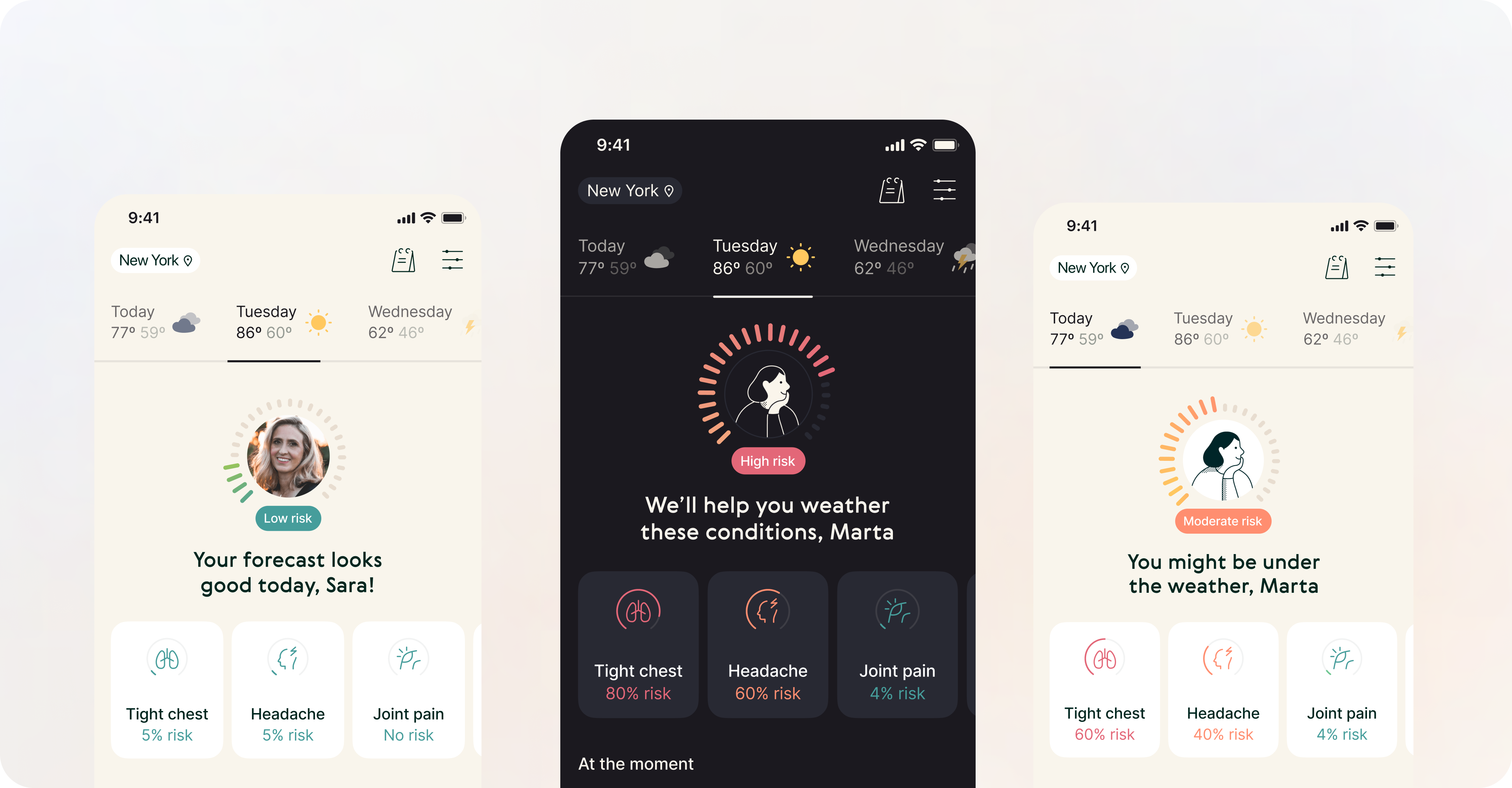
By introducing Personal Health Forecasts, we have managed to provide unique value that was personalised and easily accesible by the users. It also differentiated us from the competitors, leaving the risks of being “simply weather app” behind. Consequently, short-term retention increased by 4% during only the first week (D1-D7).
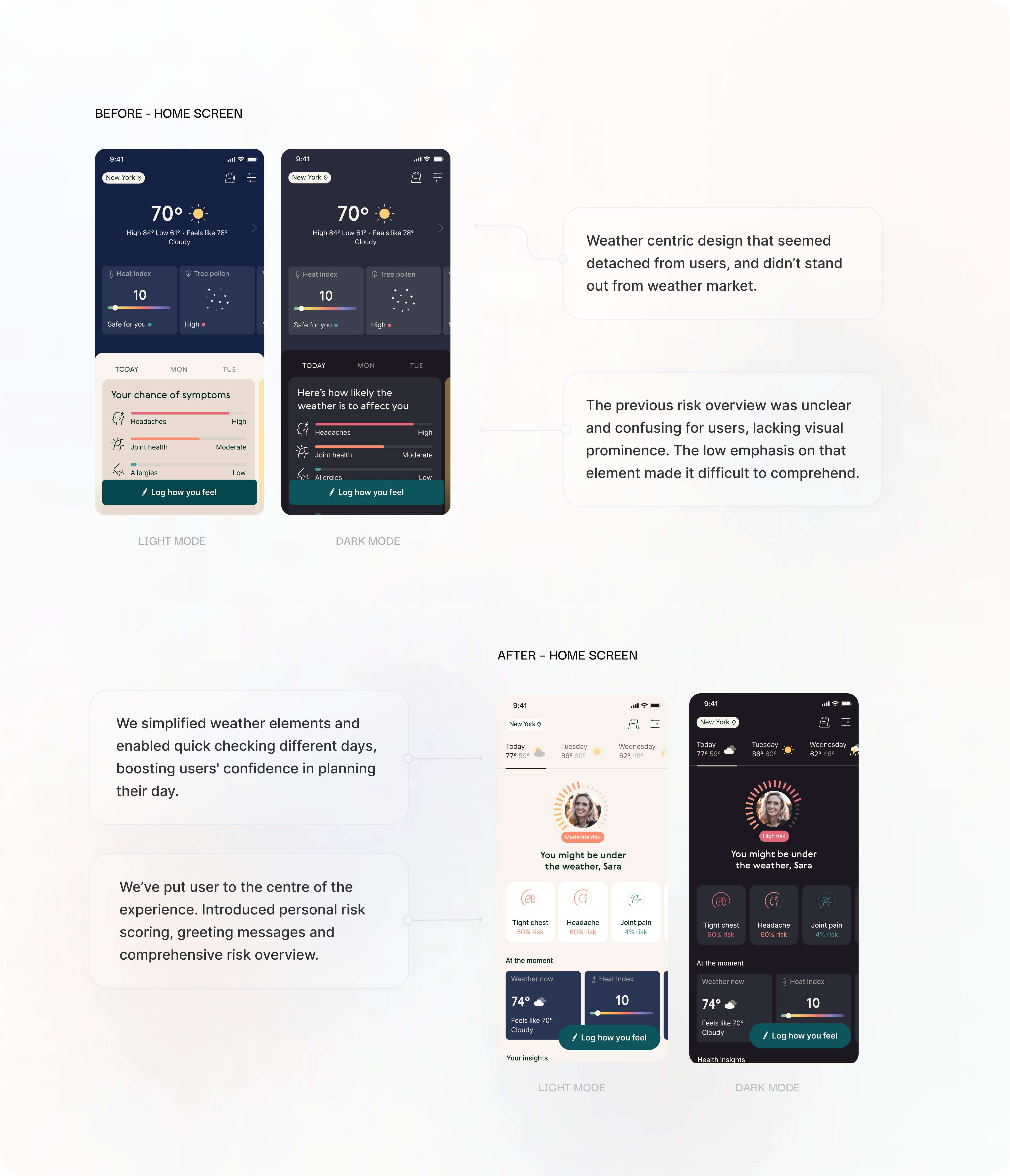
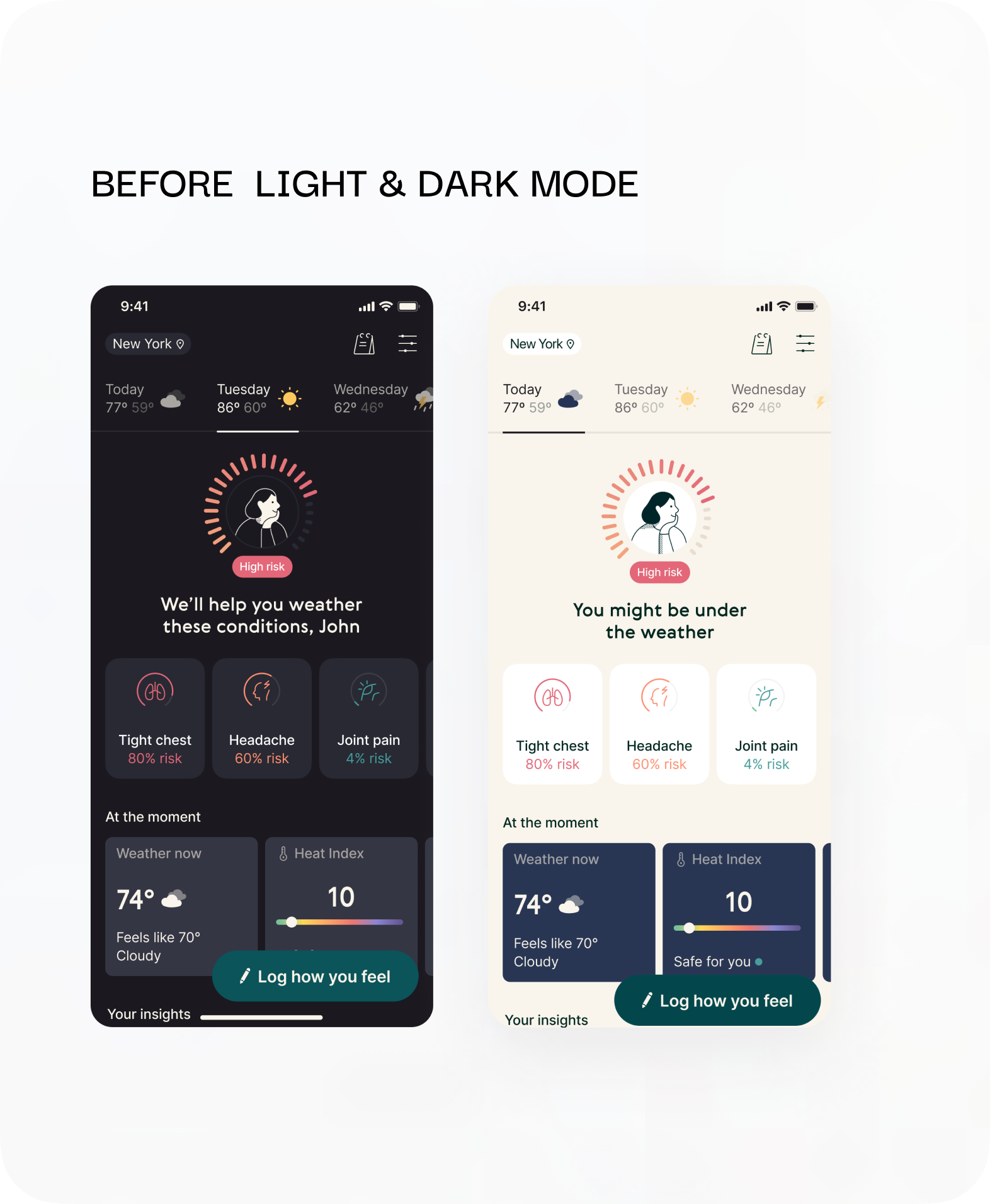
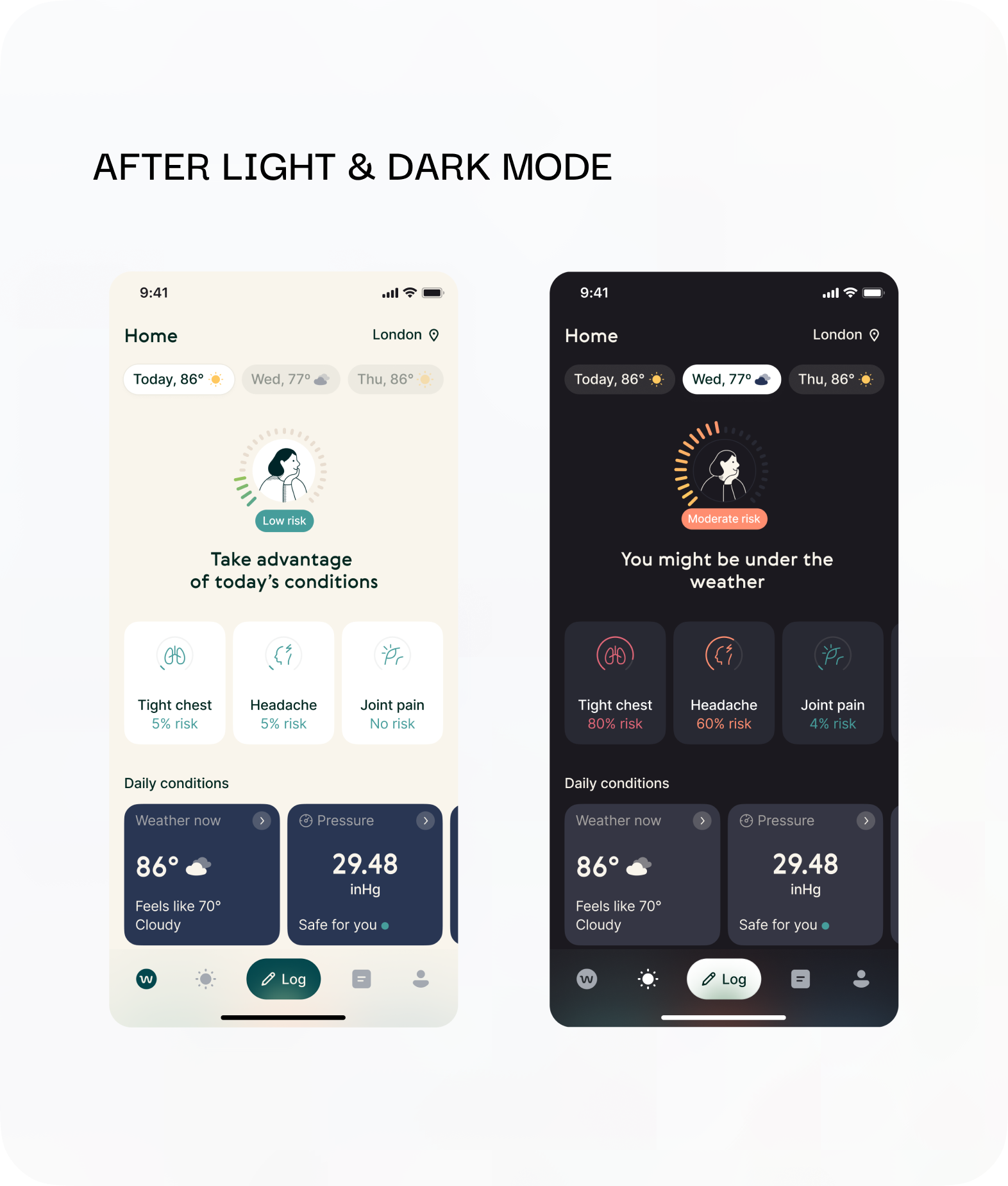
Visually heavy and inconsistent upper navigation that takes a lot of space.
Entry points to key features scattered across the Home screen and hidden under unclear icon.
Log button even though quite big, lacks contrast against darker elements such as weather tiles.
Simple and consistent upper navigation. Clearer visual feedback and confirmation.
Key feature grouped together in a touch-friendly, intuitive tab bar.
Discovery
I have joined the WeatherWell team right after the explorations had started. Initial user interviews together with the results from PMF survey uncovered that our users appreciated the weather data content and the way it was presented. The problem was, that it didn’t seem to be actionable for them. They didn’t understand it’s impact on their health, and how to prepare for it. There was also a strong personalisation desire, that wasn’t something we could offer at that time.
Key hypothesis
“We believe that providing our users personalised health forecast could bring them unique value and differentiate us from the competitors, leading to increased retention of our users.”
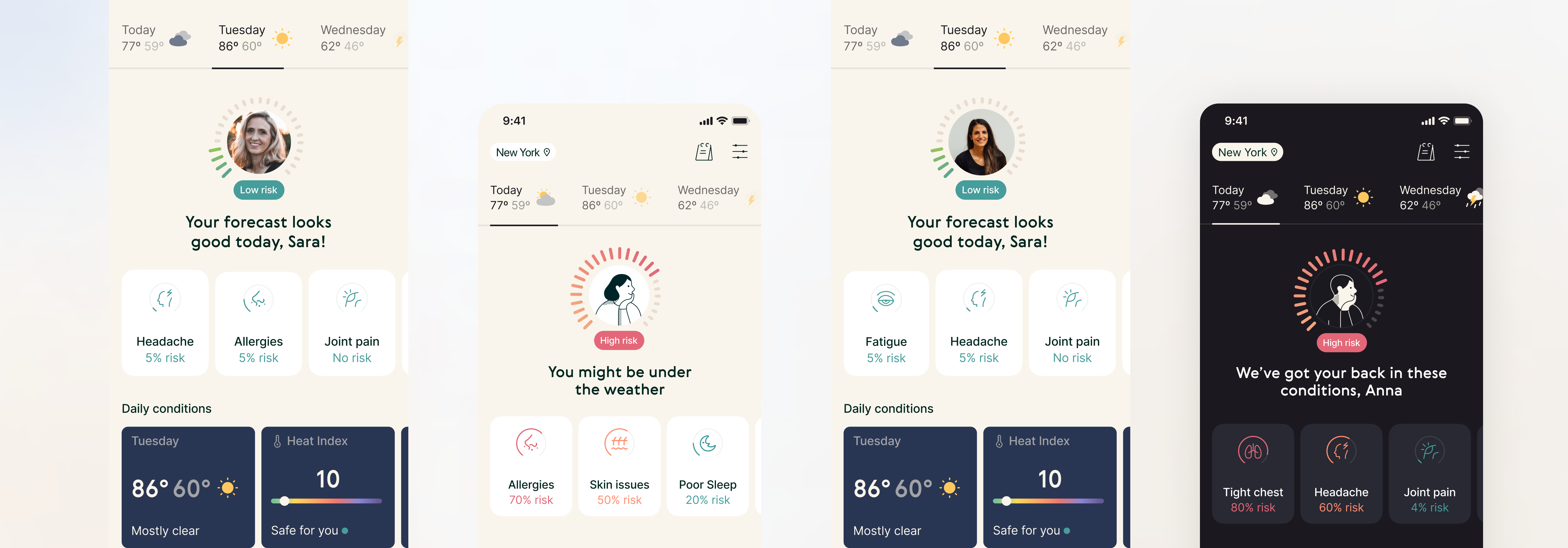
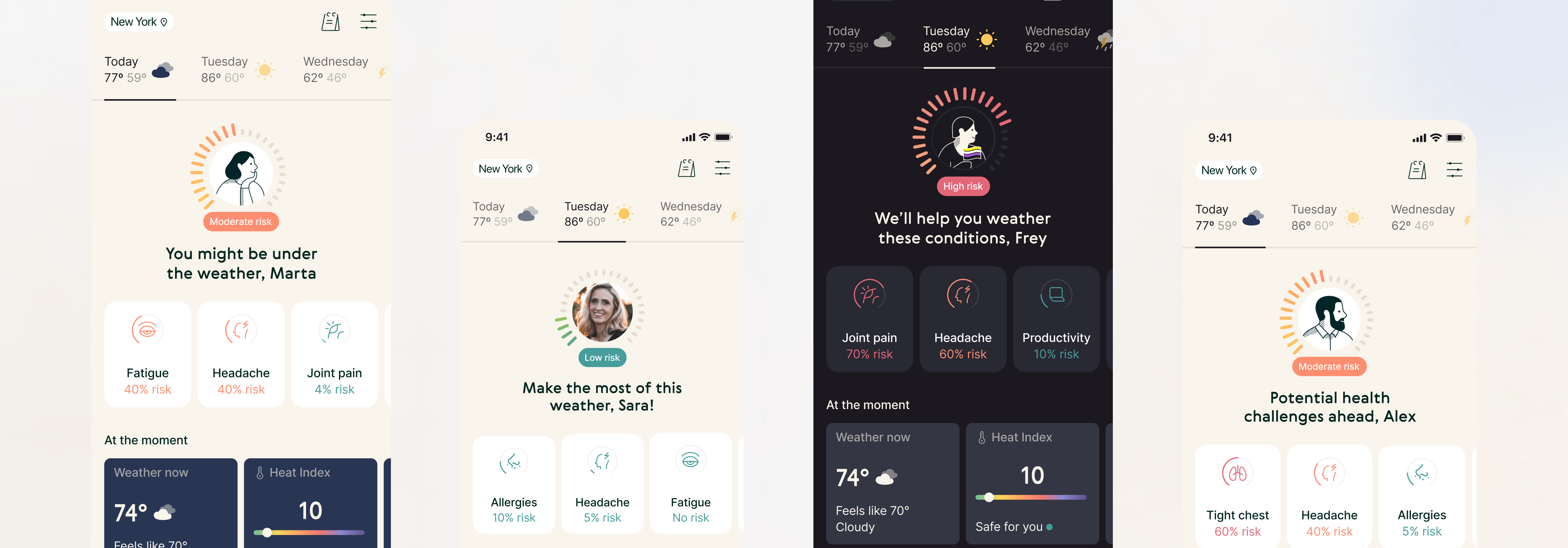
Knowing this context, we have decided to explore the idea of “Personal health forecasts” – the way to provide medical credited tips that our users can leverage to feel better.
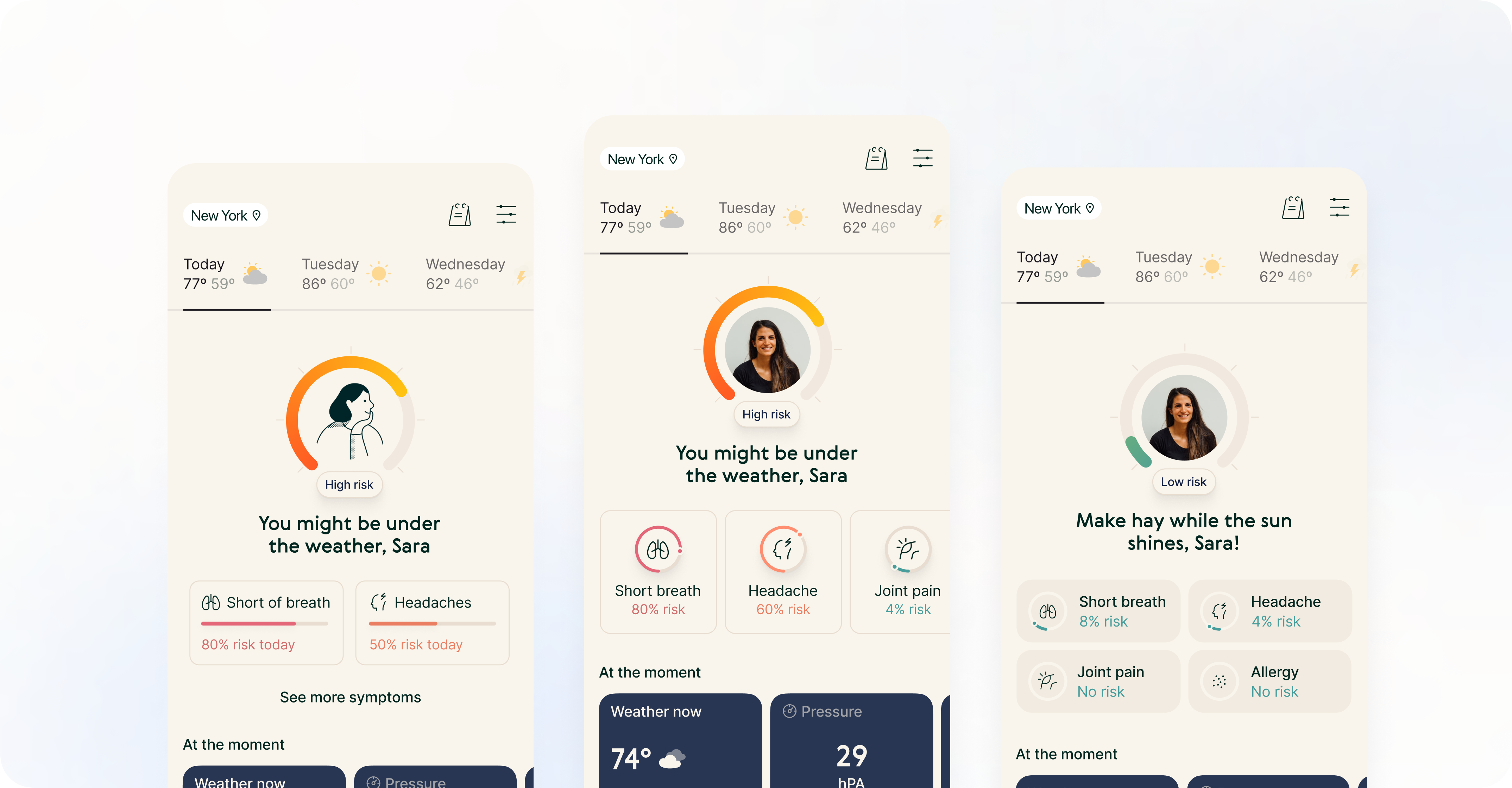
Ideating, iterating
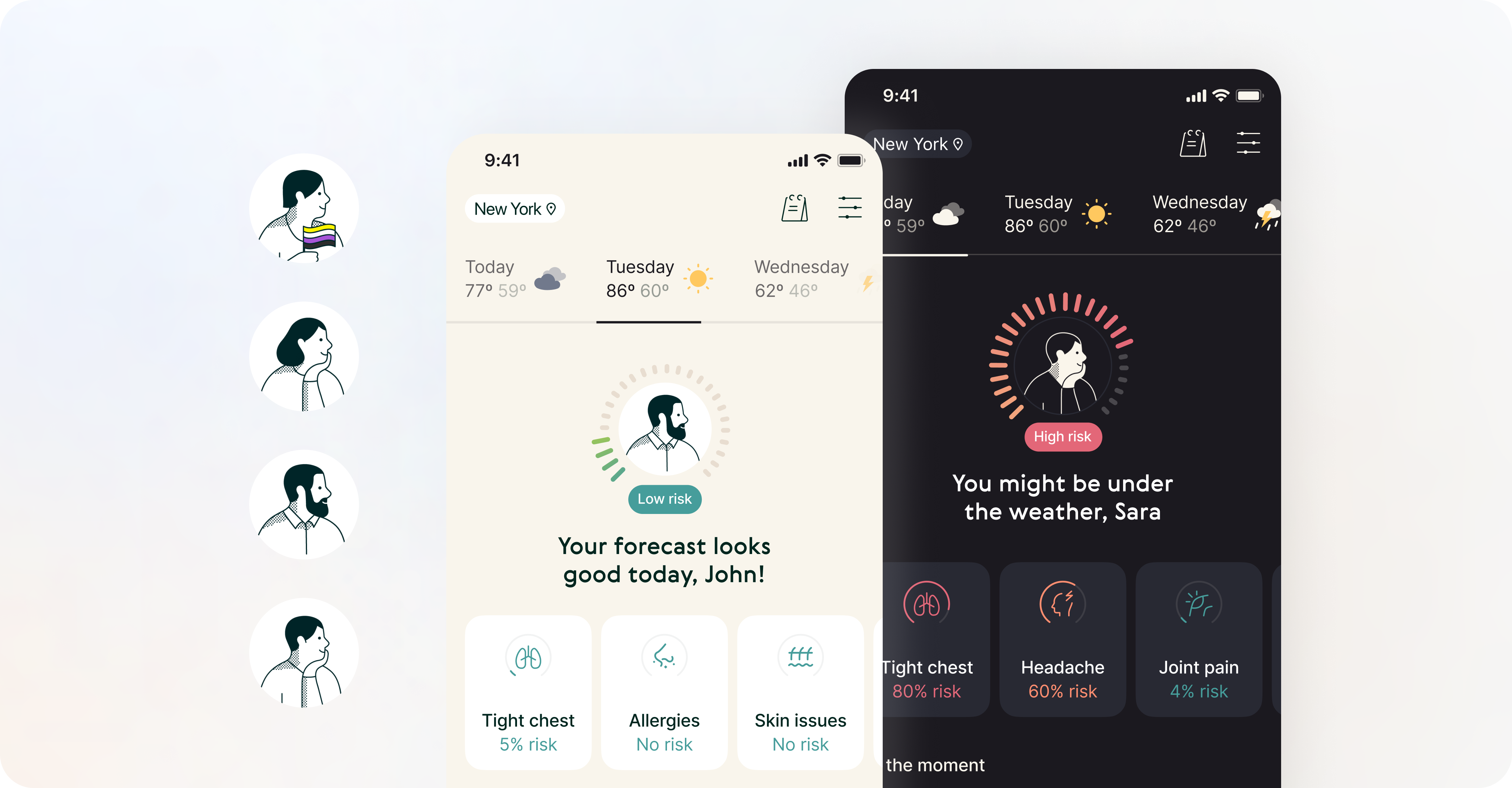
The initial design explorations were created prior to my involvement with the team. They were created based on previously discovered insights. Mockups showcased various exploration on personalisation and health forecast, like weather data sets and their potential impact on individual users.
With the assistance of a UX researcher, we have discovered valuable insights from the usability testing, such as uncertainty regarding the relationship between symptom probability and the likelihood of being affected or unaffected by specific symptoms.
The significant amount of users also communicated the lack of a comprehensive overview that prevented them from quickly grasping the expected outcomes.
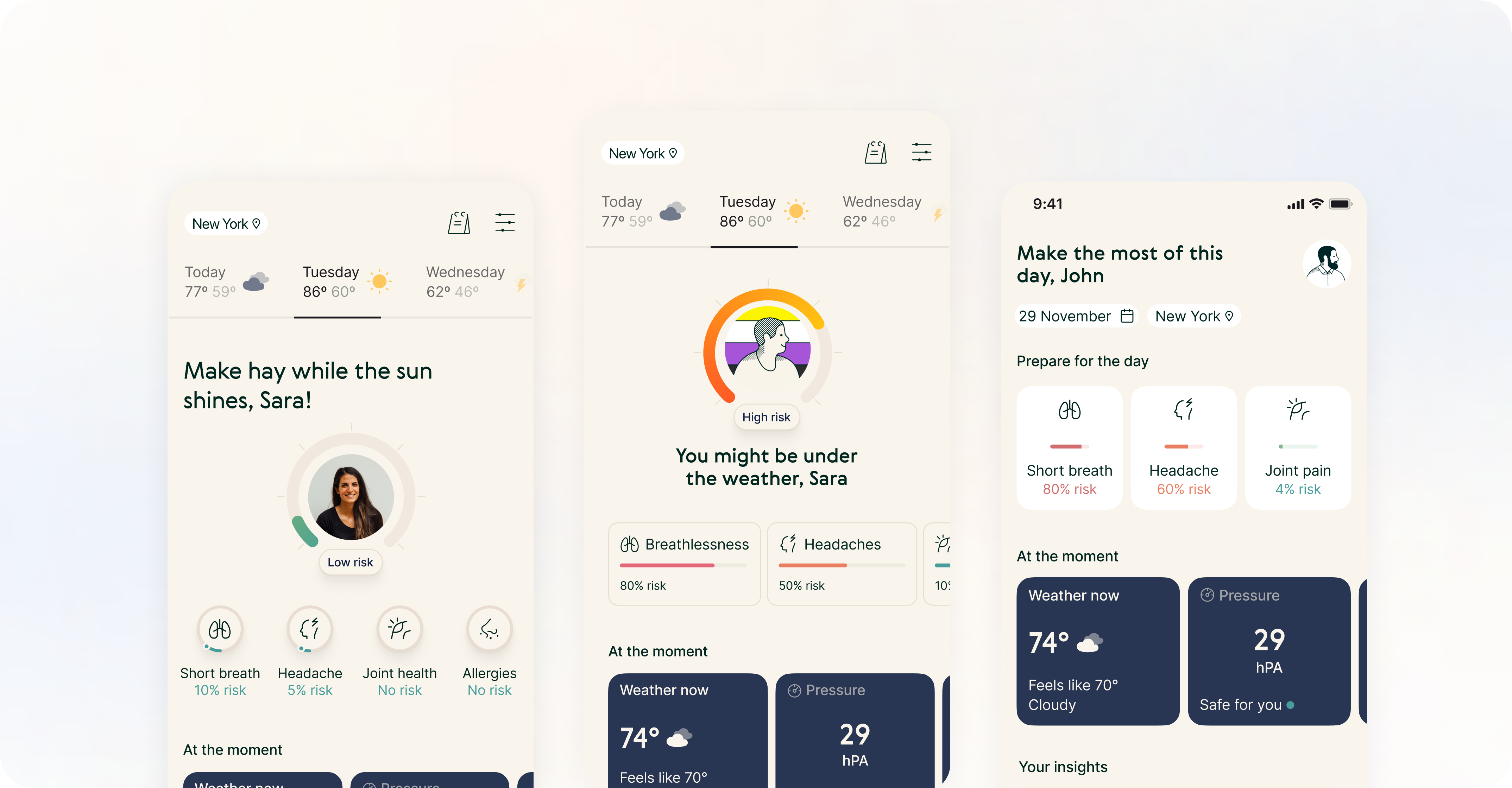
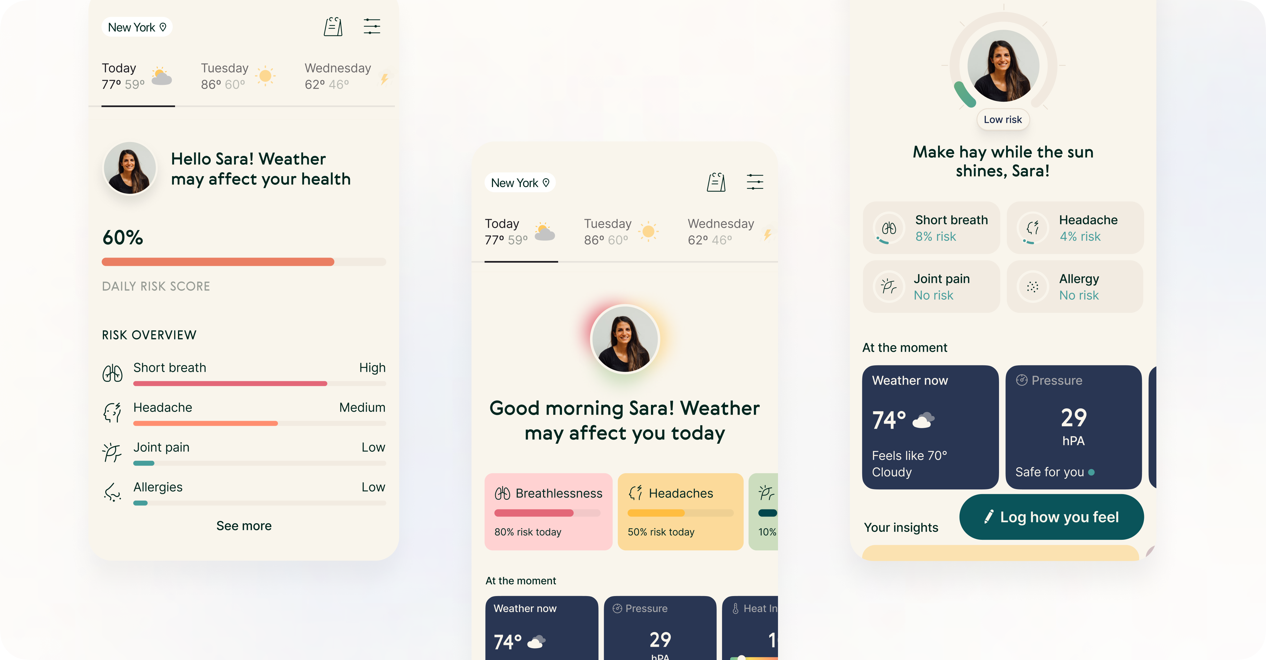
Few iterations later...
We kept working on further improvements just to get another round of feedback from our users. They have expressed the desire for the app to be highly personalised and assist them in preparing for the current and upcoming days.
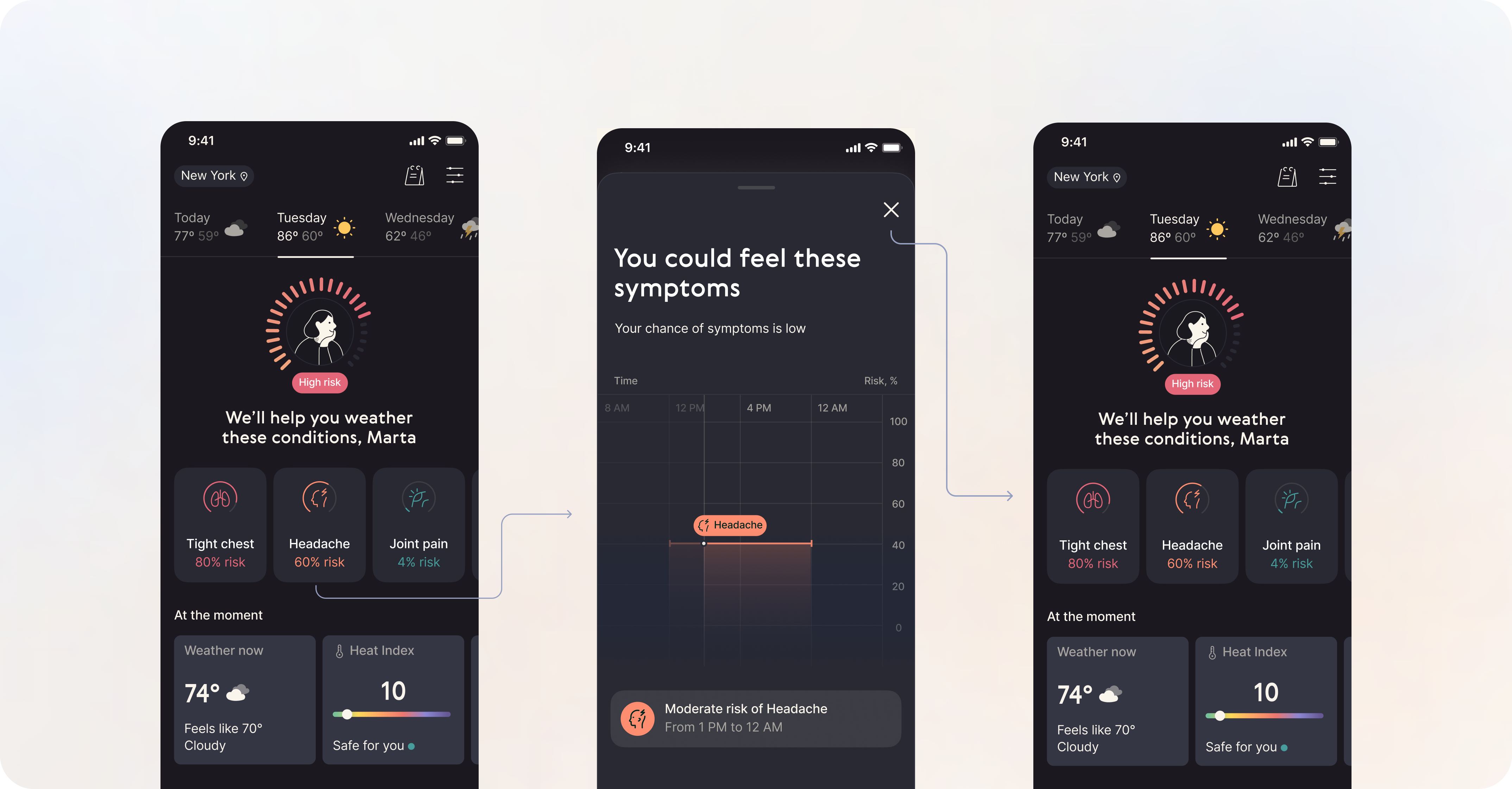
It turned out that successfully showing the risk for a particular domain in an understandable way while prioritizing the symptoms that users are most interested in turned out to be quite a challenge. We had to properly balance and find the most comprehensive representation of insights.
On top of that, the screen was perceived as overwhelming and too packed with insights, even though deeper dive into possible preventions was desired. Addressing that feedback got us close enough to prepare for the implementation.
Impact and learnings
By introducing personal health forecasts, we have managed to provide unique value, that is easily accessible to the users and differentiates us from the competitors. Consequently, short-term retention increased by 4% during only the first week (D1-D7).
Working in such a pace is nothing, but a constant learning. Few highlights I have learned, or put even more emphasis on as a result:
01
Launching health overview did get us closer to personalised and unique experience. It wasn’t just another launch of the feature, but the first step of changing the holistic experience of our product, to be more actionable and insightful. We knew that it was just the beginning, and already had in mind next, gradual improvements that could support this transformation. Starting small was necessary to validate our hypothesis in a cost-efficient way.
02
During the research phase we have discovered tons of opportunities to improve personalization and help our users in more predictive and data-driven way. We have noticed how much more needed to be done for fully individualized experience. Understanding the ratio of impact and effort helped us prioritize our work further and focus on the right thing.