Rattle is a web product that helps sales team work faster by smart integrations with Slack, Salesforce, and others. My goal was to help them improve user adoption by enhancing user experience of their product as well as refresh the visual layer.
I’ve worked on this project for a couple of months in 2022.
Project overview
After the kick-off, we understood the challenge that we’ve been asked to help with – low user adoption. My colleagues from Tonik decided to conduct the UX audit of the whole journey in order to identify the potential churn / problematic points. My main role was to find and actually solve the problems that were uncovered during the audit process.
Design process
Since the audit was already done when I joined the project, I have decided to prioritize the problems that were discovered, and run the design process of resolving them. It couldn’t happen without the close collaboration with the development team, since we were aiming for quick implementation and testing of potential solutions.
Process overview
UX Audit
User flow chart
Wireframes
Design system
Product UI
Improving user flow
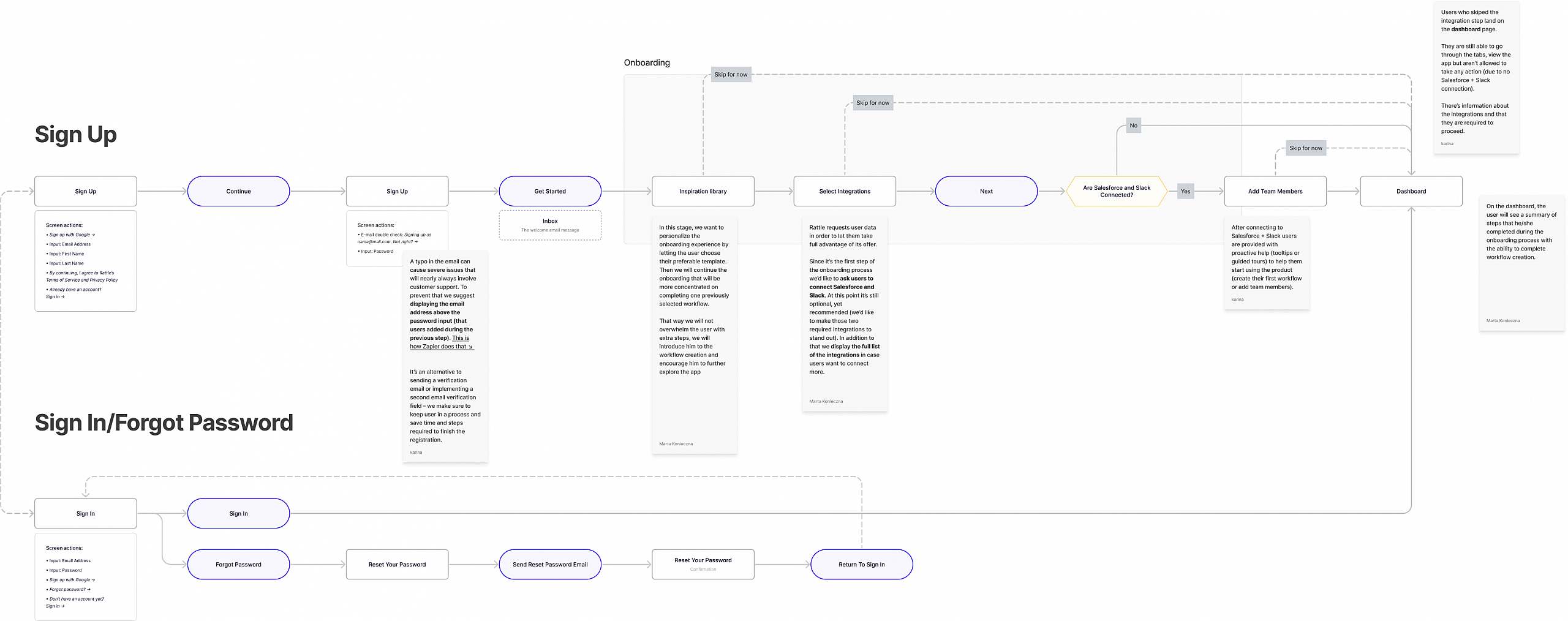
The audit showed clearly that the current onboarding solution was not clear and informative enough for the users. Our next step was mapping the new, refined user flow of the onboarding process. We’ve hoped that this improved onboarding process, but also guided walk-through in the app will lead to to increased activation, and also the adoption of offered solutions.
Wireframes
Having finalized user onboarding flow and the new walk-through mechanism, we had a structure needed to create a wireframes. They were direct reflection of the improved process we have worked out, and allowed Rattle’s team to understand better the changes we have introduced.
Design system
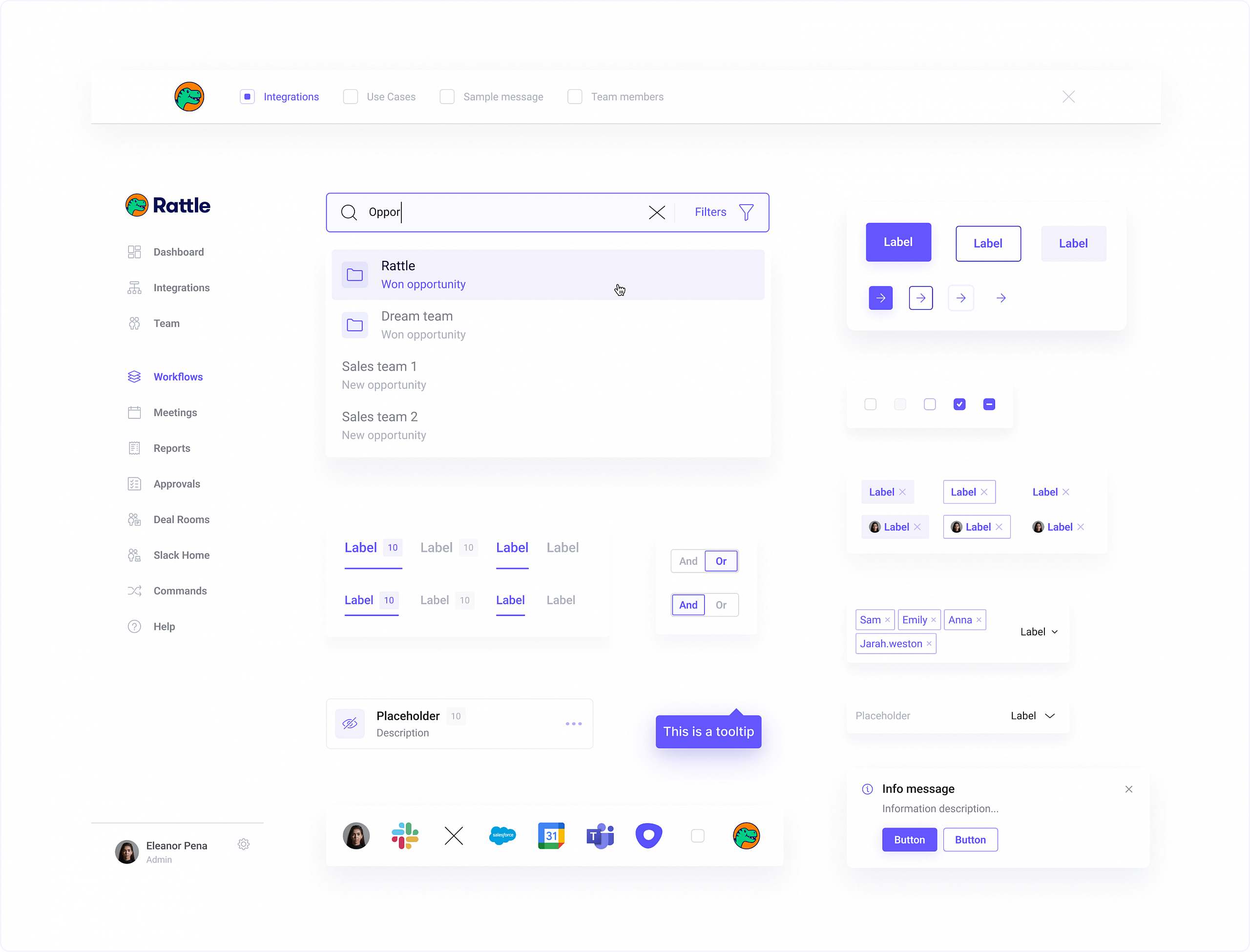
At the beginning of visual phase, we have simultanously started working on the first screens, as well as on documenting the first few components in a form of a design system.
We have decided to work on those two things in parralel, since from one perspective we wanted to have the first UI screens ready, but on the other hand we wanted to provide elements of design system to engineers, for them to be able to start working on it.
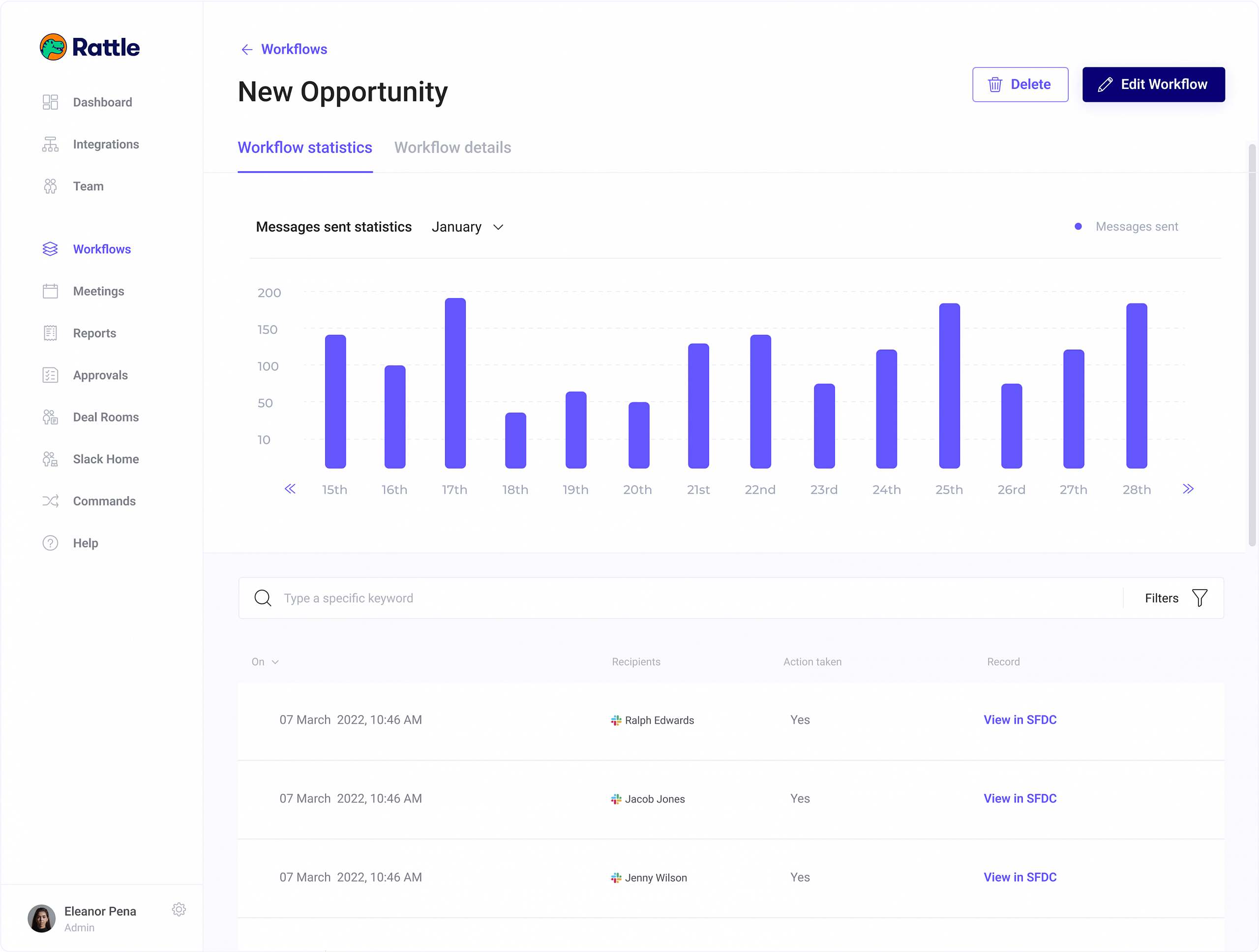
Visual layer
During the visual phase we have focused on staying aligned with both Rattle’s brand guidelines, and the design system principles we’ve established earlier.
The visual style of a product was aligned with more „salesy” & colorful website of Rattle, but was much simpler, cleaner and more eye-pleasing. That way we have avoided overwhelming the users and made decision-making process as simple as possible.
")