Helped in bringing people closer to value
with seamless navigation
Context
WeatherWell is an iOS app that helps weather sensitive people feel healthier and embrace active living by personalised predictions and medical credited tips.
In 2022, I Joined WeatherWell as a Product Designer to help validate Product Market Fit. During this period, we were focused on bringing people closer to the value by increasing conversion and retention rates for key features like Symptom Logging and Journal.
Results
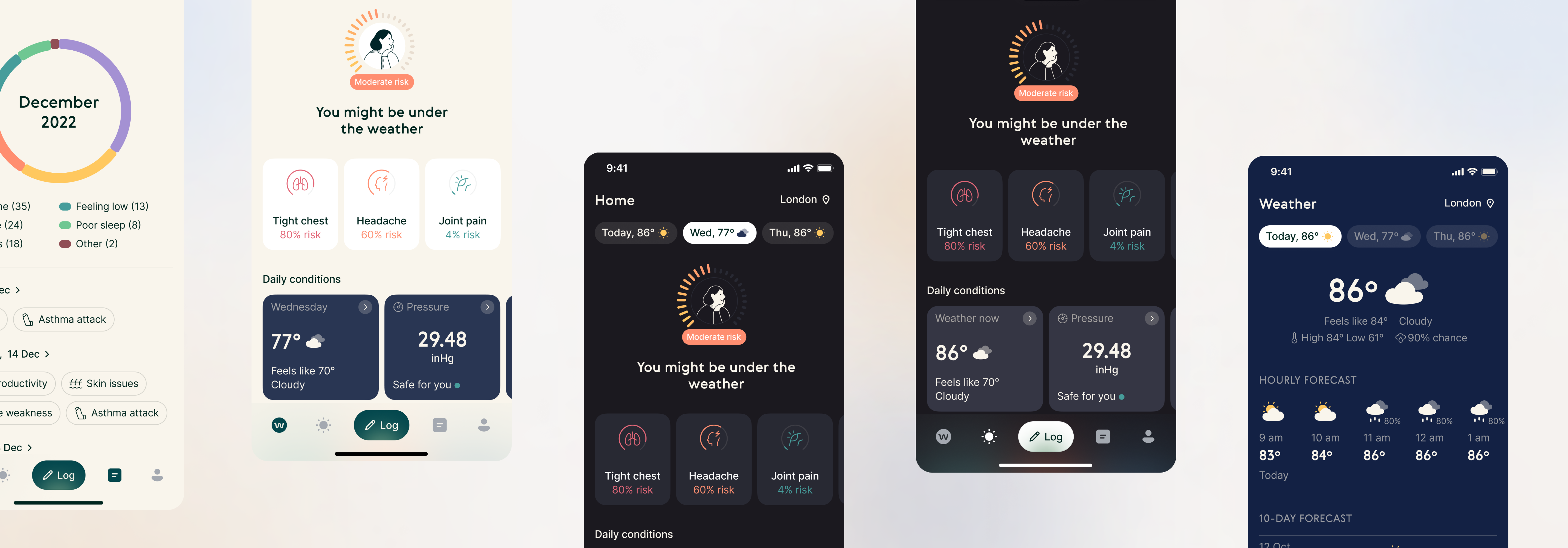
After 4 months of deep product discovery process we introduced a new seamless, user-friendly navigation that prominently showcases important functionality and brings users close to the value. We have managed to increase conversion rate of Journal page by +5.9%, and symptom logging by +6%.
Discovery
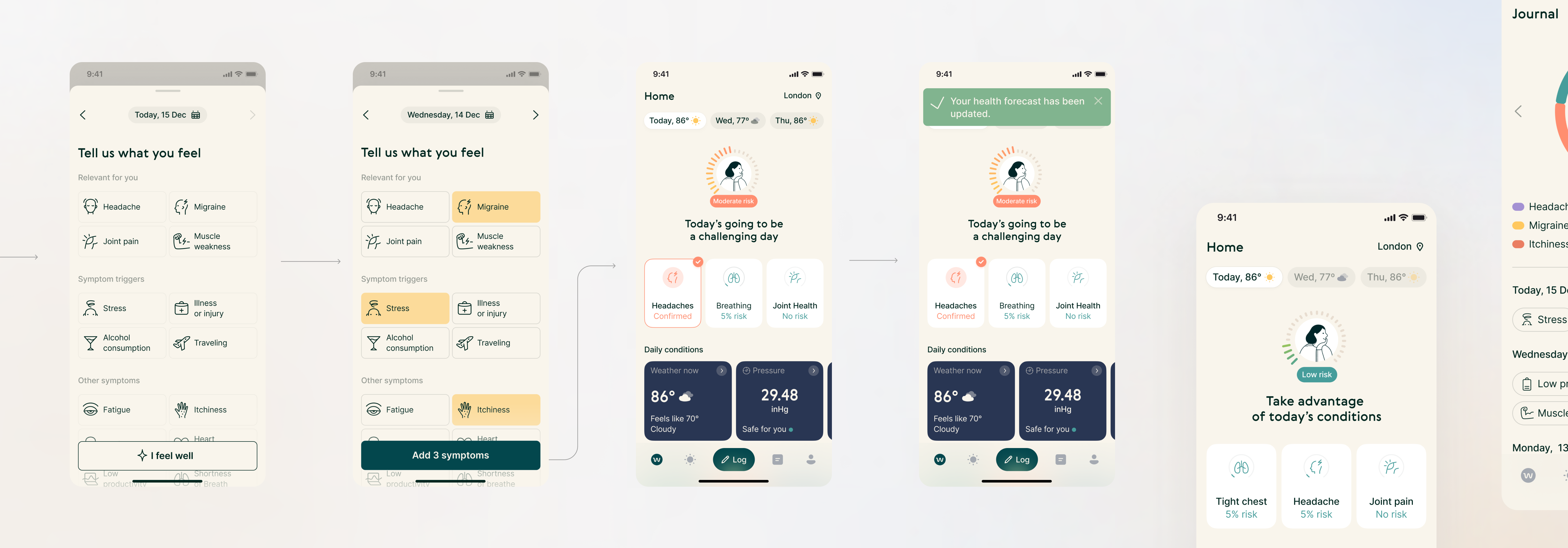
Symptom Logging and Journal Page were our strategic bets for getting us closer to Product-Market fit. Even though they were proven to bring our users significant value, they weren’t accessible enough to frequently use them.
Looking at quantitative data, we have noticed their low conversion. To understand better what was causing this issue, we have leveraged existing qualitative insights.
Key hypothesis
„We believe that clearly exposing Symptom Logging and Journal to the user in main navigation will improve time to value, as measured by conversion and short-term retention (D1-D7)”.
The main conclusion was, that our current navigation system is visually heavy and confusing. Our users struggled navigating through the app, which prevented them from finding core features and value. User interviews we have conducted later on confirmed that as well.
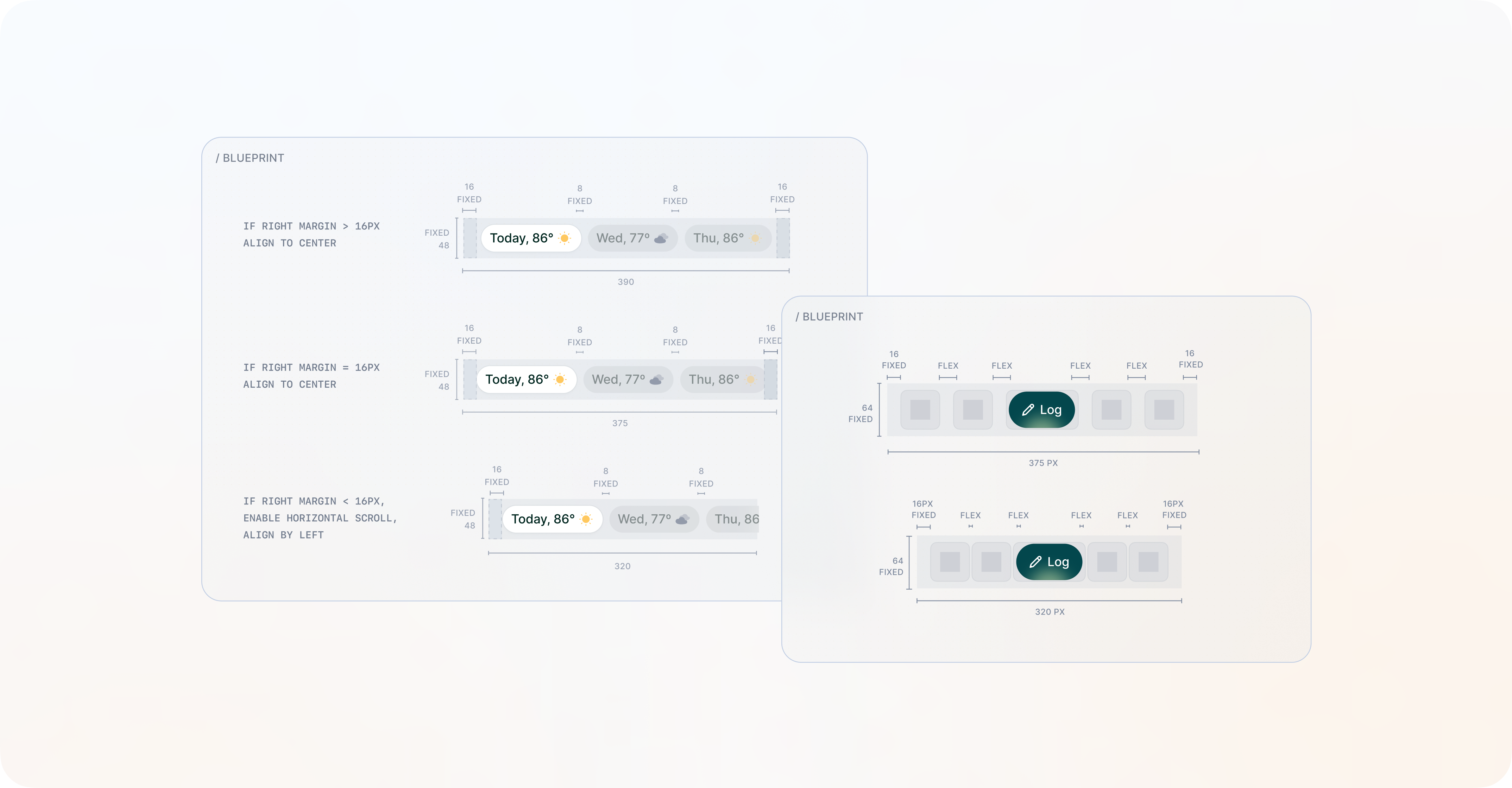
Ideation and testing
Armed with the insights from user research, we have generated a range of potential solutions. In order to minimize both costs and pre-PMF risks. The way to go, was through rapid iterations on design prototypes, while keeping our customers in constant feedback loop.
Thanks to that, in short time we have managed to work through various different navigation structures, layouts, and visual interfaces that could address the identified pain points and enhance user engagement.
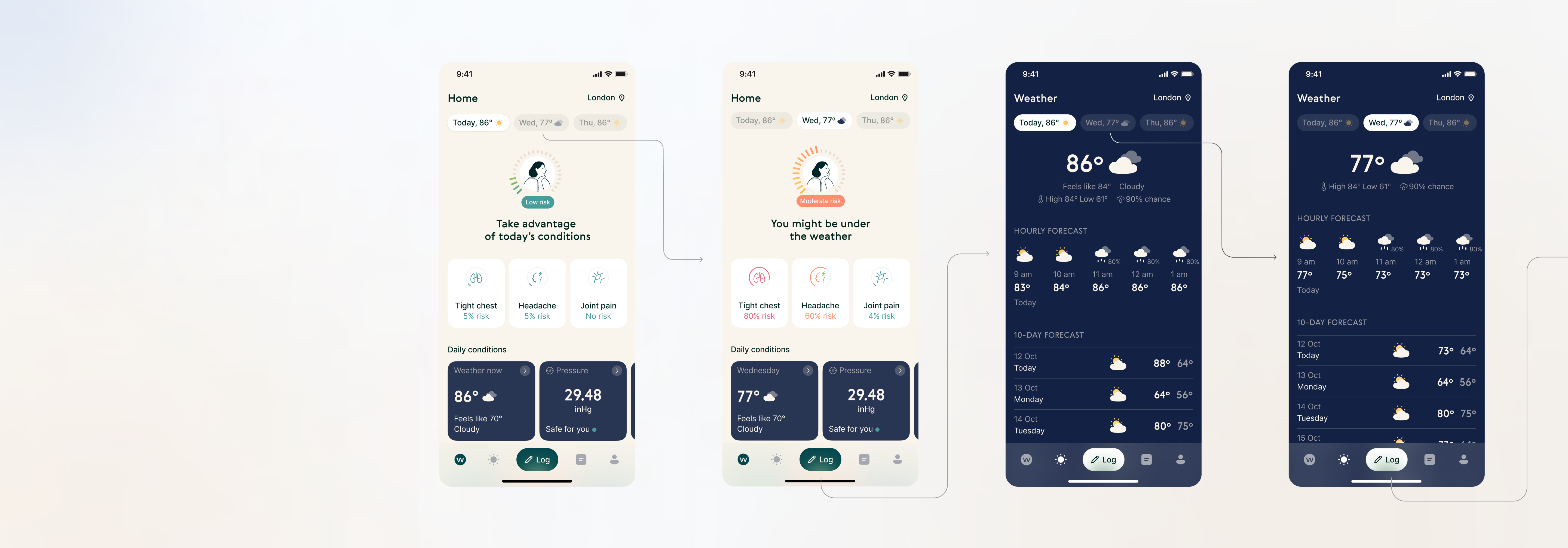
Few iterations later...
we have constructed a layout, that seemed to gather enough evidence to become the right fit for problem we wanted to solve.
Changes were implemented, and during the controlled launch, thanks to Amplitude tracking, we were able to closely monitor the impact on conversion rate and supporting metrics.
Impact and learnings
Initially after launch, we have experienced a drop in Symptom logging conversion. As we have learned, logging button wasn’t prominent enough. Quick design iteration and production fix solved that very well.
We did it! As a result, we were happy to observe a significant growth of conversion rates in Symptom Logging by 6%, and Journal Page by 5.9%. The D1-D7 retention was increased by 2.5%.
01
Amount of “not building the right thing” risk you can reduce by rapid experimentation.
02
The importance of continuous feedback loop achieved by keeping users close to each phase of product development.
03
Even with the most thorough user testing, you cannot predict the exact interaction of user with the product, so after-launch monitoring is crucial to quickly react and adjust the course.